No testimonial added yet.
The Challenge
Autumn wanted to launch as more than another hair care label on a crowded shelf. In a market saturated with beauty and hair care brands competing for attention, they needed an identity that spoke to confidence, transformation, and everyday self-expression — something customers could recognise instantly and trust before they'd even tried the product.
Their brief was clear: create a logo and hair care brand identity that felt premium, modern, and deeply connected to the ritual of hair care itself — not just another wordmark, but a symbol customers would associate with healthy hair, elegance, and beauty.
Our Approach:
At ProdyJeez, every brand identity we build starts with a story, not a template. For Autumn, that story lives in a single letterform.
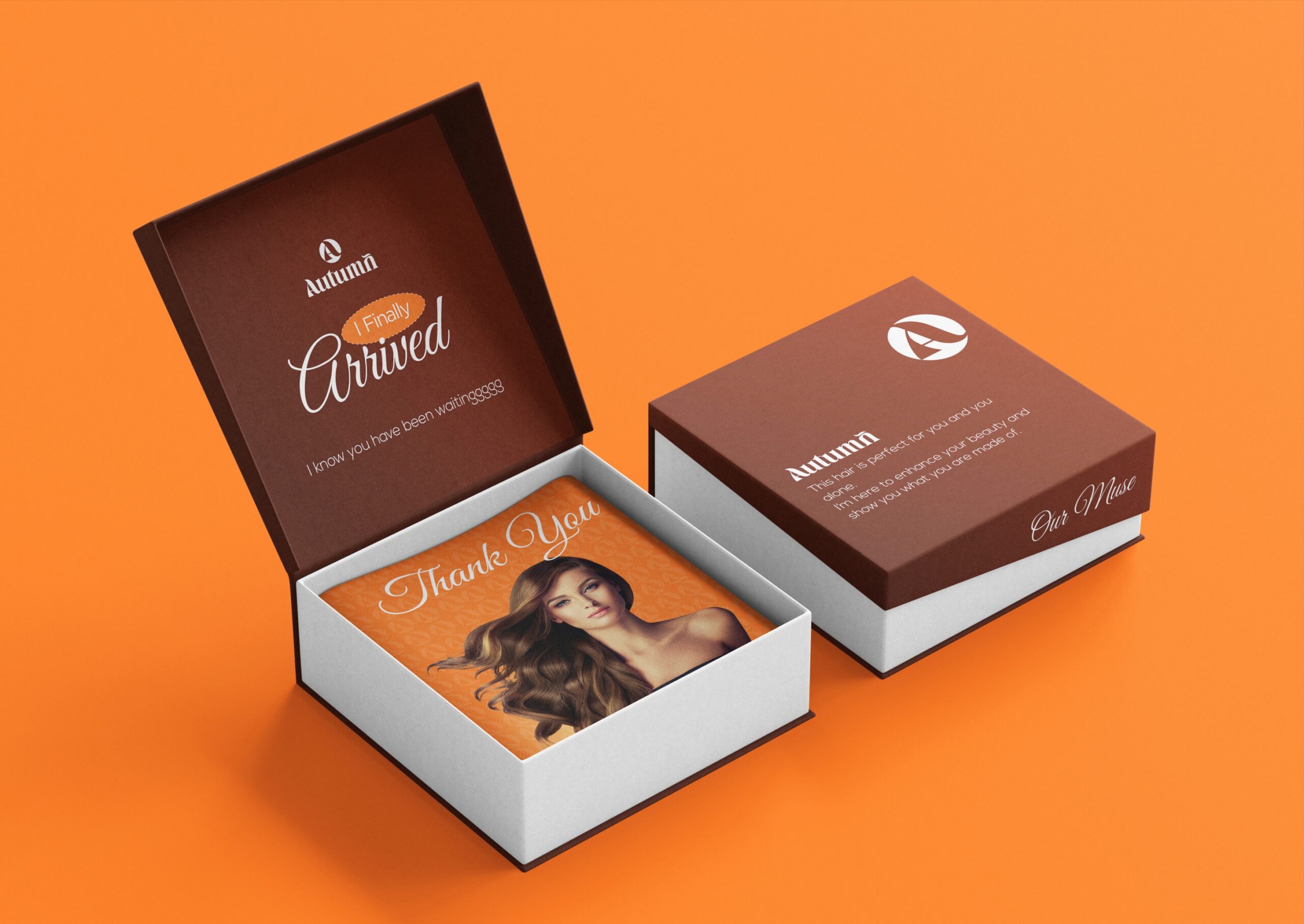
The "A", Reimagined as Hair. We built the Autumn logo icon by fusing the letter "A" with a flowing hair strand, turning the brand's initial into a symbol of movement, texture, and transformation. The result is a mark that's unmistakably about hair, without relying on literal imagery like scissors or combs, the kind of clever, ownable symbol that ages well and scales across packaging, social, and print.
A Wordmark With Character. The Autumn wordmark carries the same DNA as the icon; bold, high-contrast serif detailing with a distinctive flick on the double "m" that echoes the strand motif from the logo. It reads as premium and editorial, positioning Autumn closer to a lifestyle beauty label than a mass-market hair product.
A Signature Brand Pattern. To extend the identity beyond the logo, we developed a repeating "hair strands" pattern built directly from the wordmark's typography, alternating strand shapes that create rhythm and movement. This became a reusable brand asset for packaging borders, social templates, and print collateral, giving Autumn a consistent visual signature customers will recognise at a glance, even without the logo present.
Our Core Brand Philosophy:
At ProdyJeez, we believe every hair and beauty brand identity should tell a story, not just look good. For Autumn, that story is one of self-expression , the idea that healthy, well-cared-for hair is a form of confidence, and that confidence deserves a brand that looks and feels premium from the very first touchpoint.
What We Delivered:
Logo Icon Design: A custom "A" and hair-strand emblem symbolising beauty, confidence, and transformation
Wordmark & Typography System: A bold, distinctive serif wordmark built for recognition across digital and packaging
Brand Pattern System: A signature hair-strand pattern for use across packaging, social media, and marketing materials
Brand Rationale & Positioning: A clear narrative connecting every visual element back to Autumn's core promise: elegance, movement, and premium hair care
The Outcome:
Autumn now has a hair care brand identity built to stand out on a shelf and in a feed; a logo that tells its story at a glance, a wordmark with genuine character, and a brand pattern that extends its recognition far beyond the logo itself. It's an identity designed to build trust with customers before they've even opened the product.
Looking for a hair care or beauty brand identity that does more than look pretty? At ProdyJeez, we design logos and brand systems for hair care brands, salons, and beauty founders that want to be noticed, remembered, and trusted. Book a strategy session to talk about your brand.
Your brand has a story worth telling—let’s craft a strategy that helps you stand out, connect, and grow. Book a quick, 30-minute strategy session to get expert insights tailored to you.
You’ve poured your heart into building your business. But if your brand isn’t clear, consistent, and converting, you’re leaving money on the table.